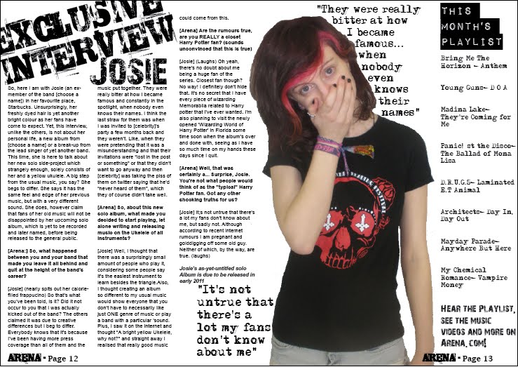
Finally, I added a red rectangle around the 'This Month's Playlist' Section and added a black edge to the left hand side of it. I also made specific words the pull quotes from the article bigger than the others, to show importance and made the outside 'Stroke' red, to compliment my house theme. I did the same to my 'Exclusive interview' text and then made the 'Josie' headline text red. I purposely dressed my model in a black tshirt with a red and white image on it so she would fit in with my general house theme of red, white, black and light grey. Also, the t-shirt is purposely a Reading festival one to make her seem like a 'normal' person and also because the festival fits in with my magazine's genre. I also changed the page number to the font 'Adler' also to compliment the house theme. I made my the picture of my model slightly smaller so that it would not take up too much space in the article and distract the reader from the text.